ESPN Monday Night Football
A custom typeface for one of sport’s most iconic brands.
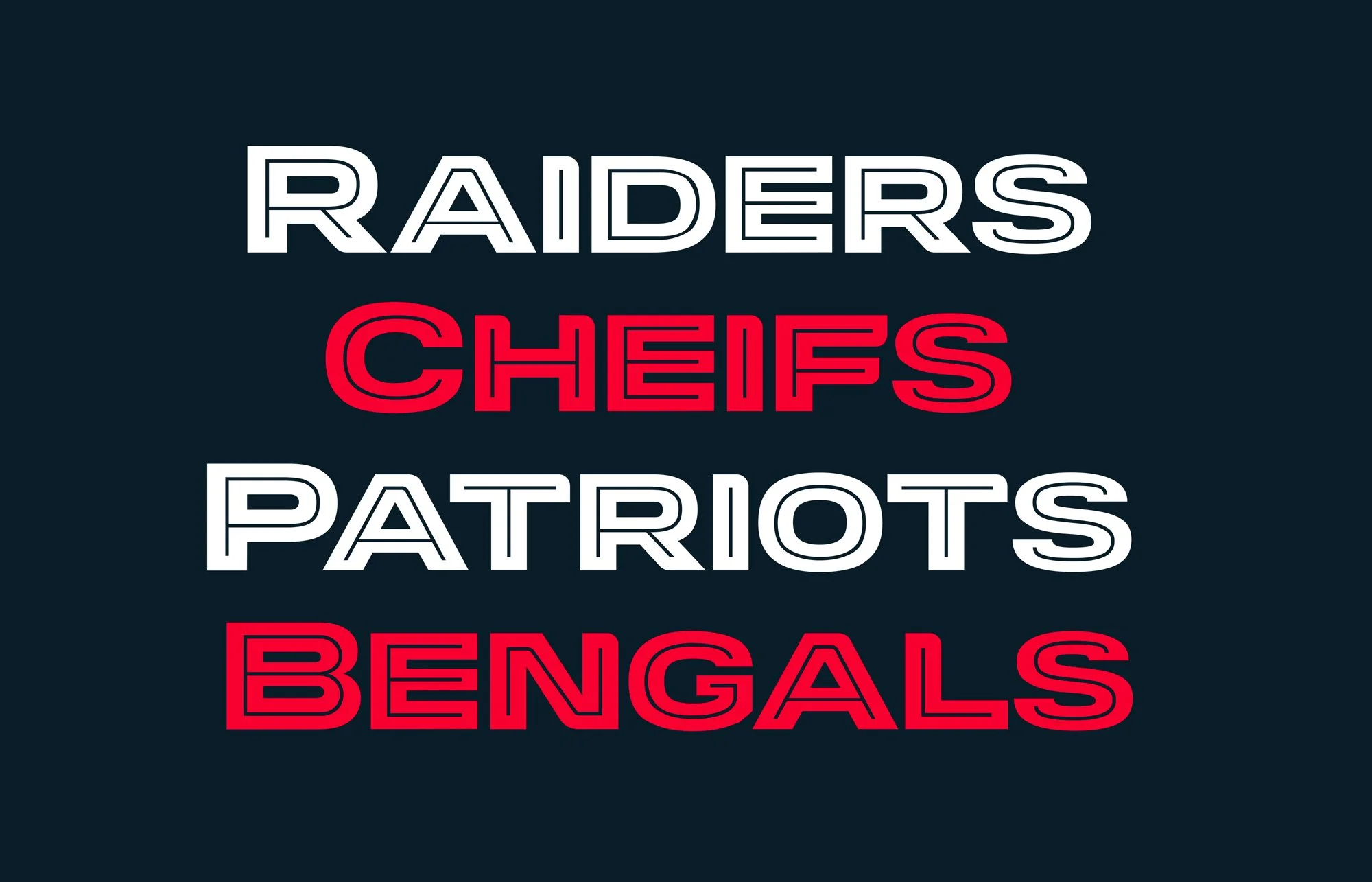
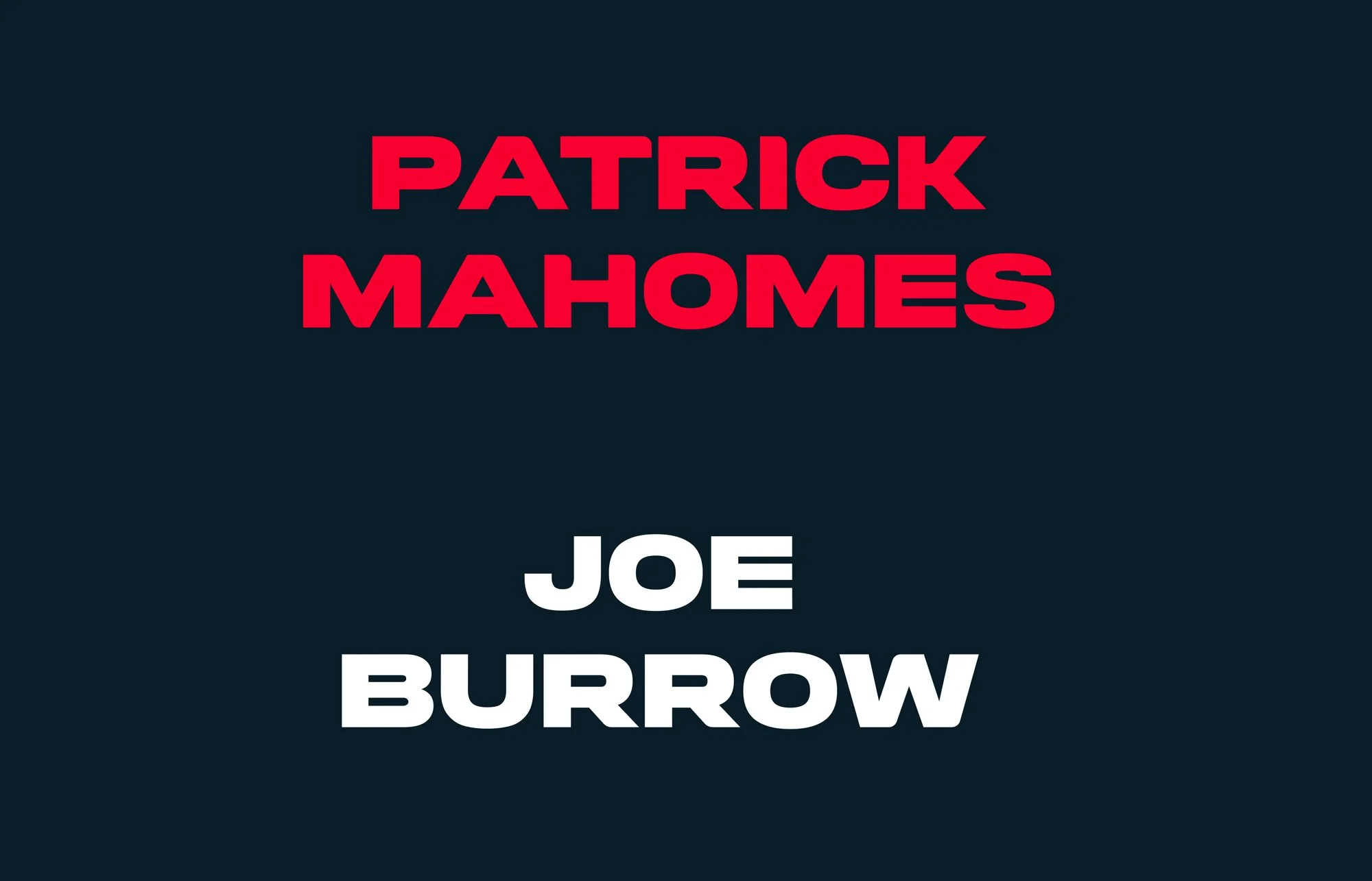
For the 2023 refresh of Monday Night Football, ESPN wanted to build on the franchise’s historic visual DNA while creating a more contemporary identity for the future. Arkitype developed Monday Night Primetime, a bespoke display typeface designed to sit naturally alongside the ESPN brand and give MNF its own distinctive typographic voice.
Monday Night Football has been a defining part of American sports broadcasting since the 1970s. The challenge was to evolve its visual identity without losing the character that made it instantly recognisable. The typeface needed to feel bold and distinctive, while remaining clean and functional across the many formats of a modern broadcast identity.

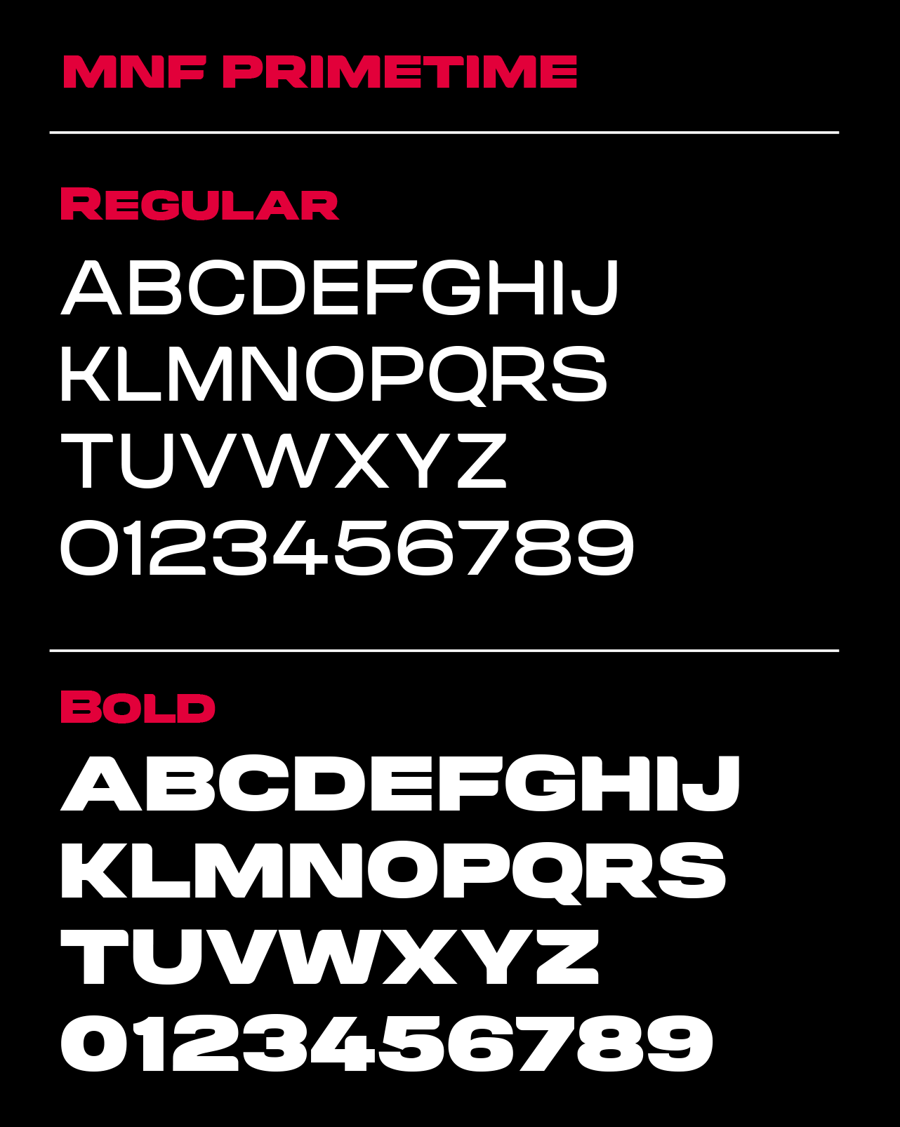
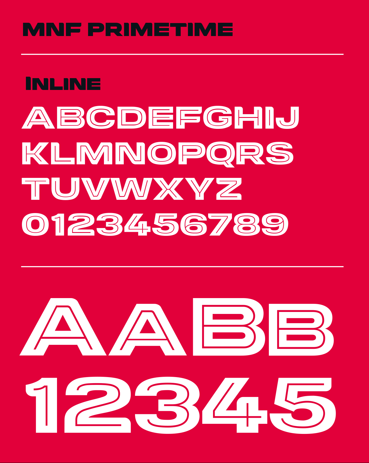
Inspired by the balance of curves and corners found in the ESPN logo, Monday Night Primetime brings a subtle connection to the wider ESPN visual language. Rather than relying on excessive stylistic details, the design focuses on strong, confident letterforms with enough character to make MNF feel ownable. The family comprises Regular, Bold and Bold Inline styles, providing flexibility across identity, broadcast graphics and supporting applications.
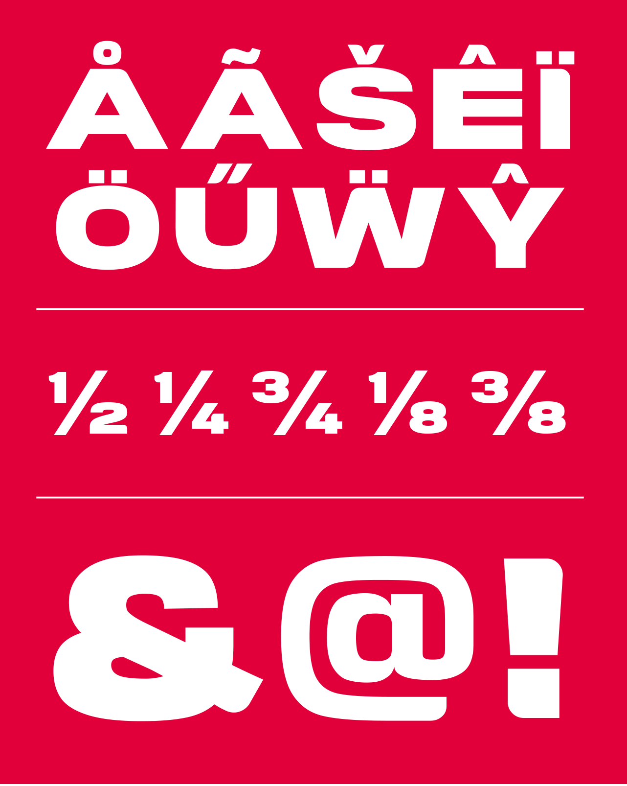
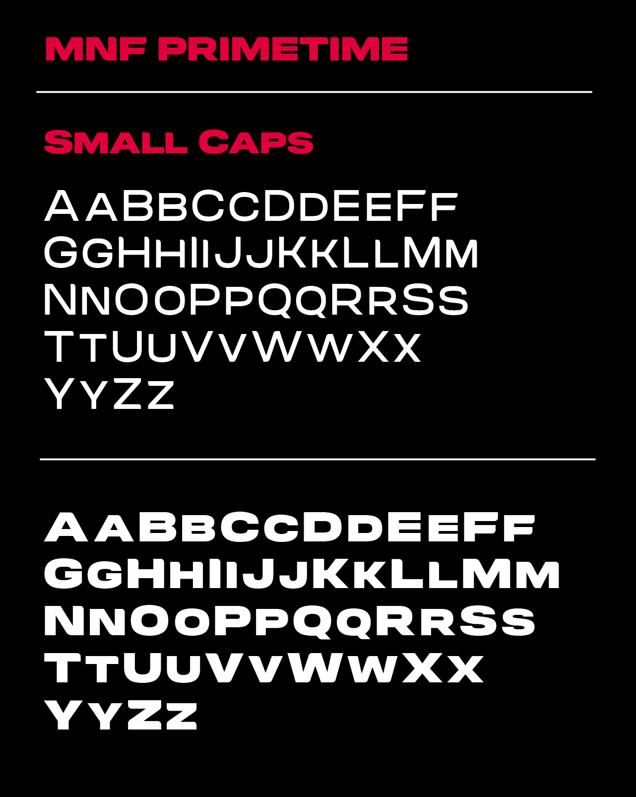
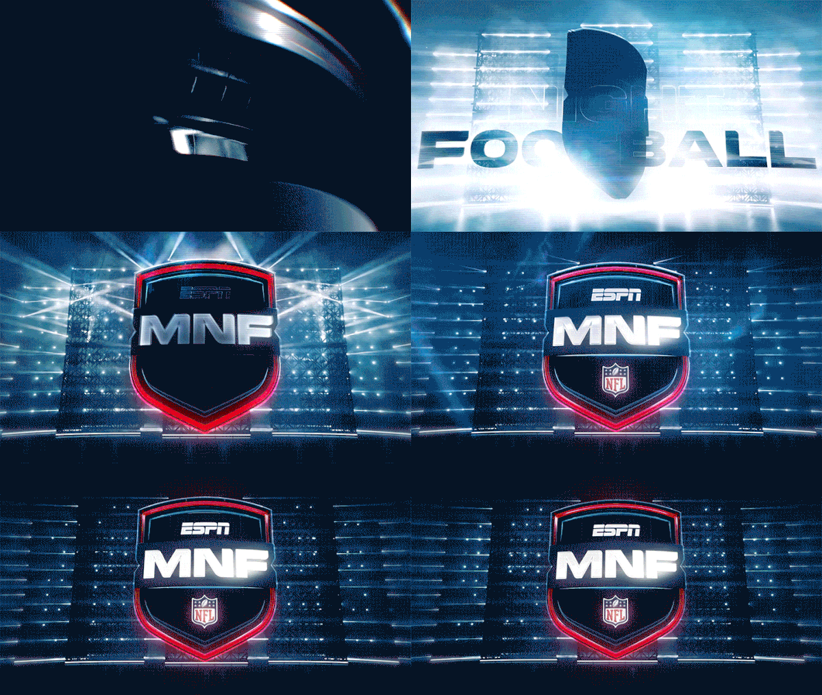
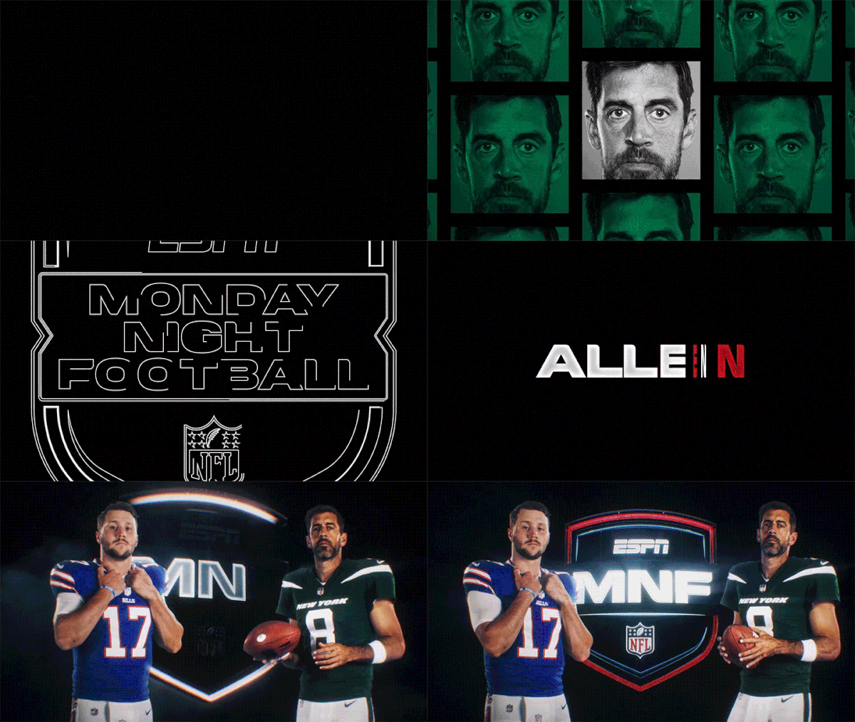
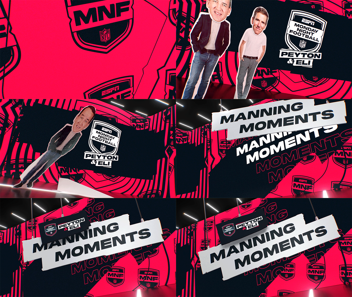
The typeface forms a key part of the refreshed MNF identity, working alongside the new shield and marquee graphic device across the broadcast ecosystem. From the logo and on-screen graphics to promotional and physical applications, Monday Night Primetime gives the franchise a consistent typographic voice — rooted in its history, but designed for the next era of Monday Night Football.