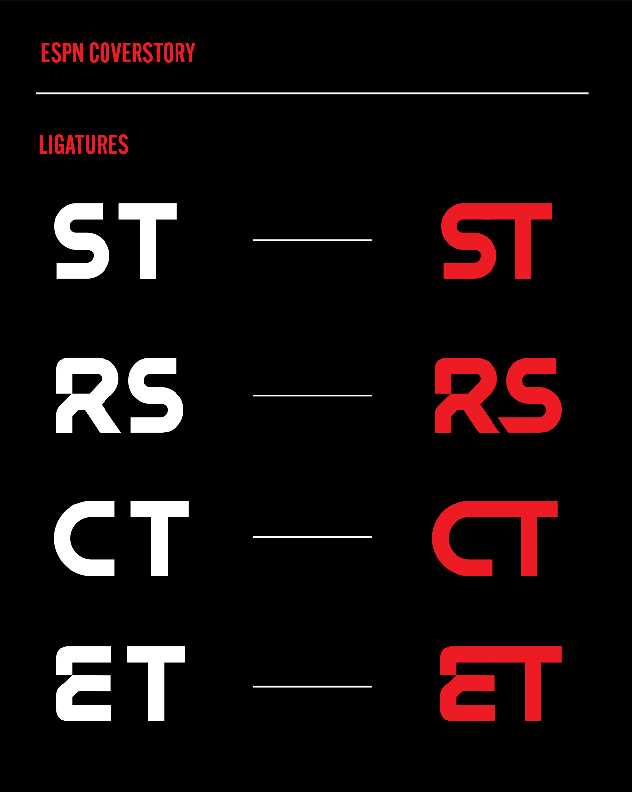
Custom brand typeface for ESPN CoverStory
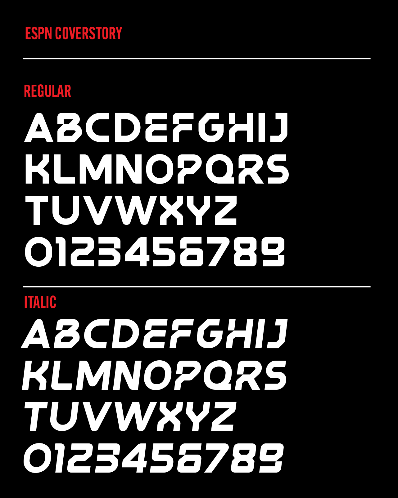
ESPN commissioned us to develop a custom typeface and design a distinctive logo for the ESPN Cover Story brand. We worked closely with their team to ensure the typeface accurately reflected the editorial tone and visual identity, attending to details such as legibility, personality, and consistency across formats, sizes, and platforms. We also oversaw usage testing and final adjustments to ensure consistent application across printed and digital pieces.
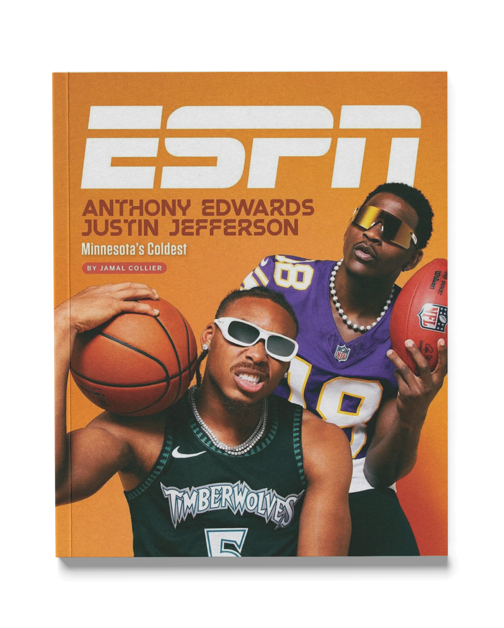
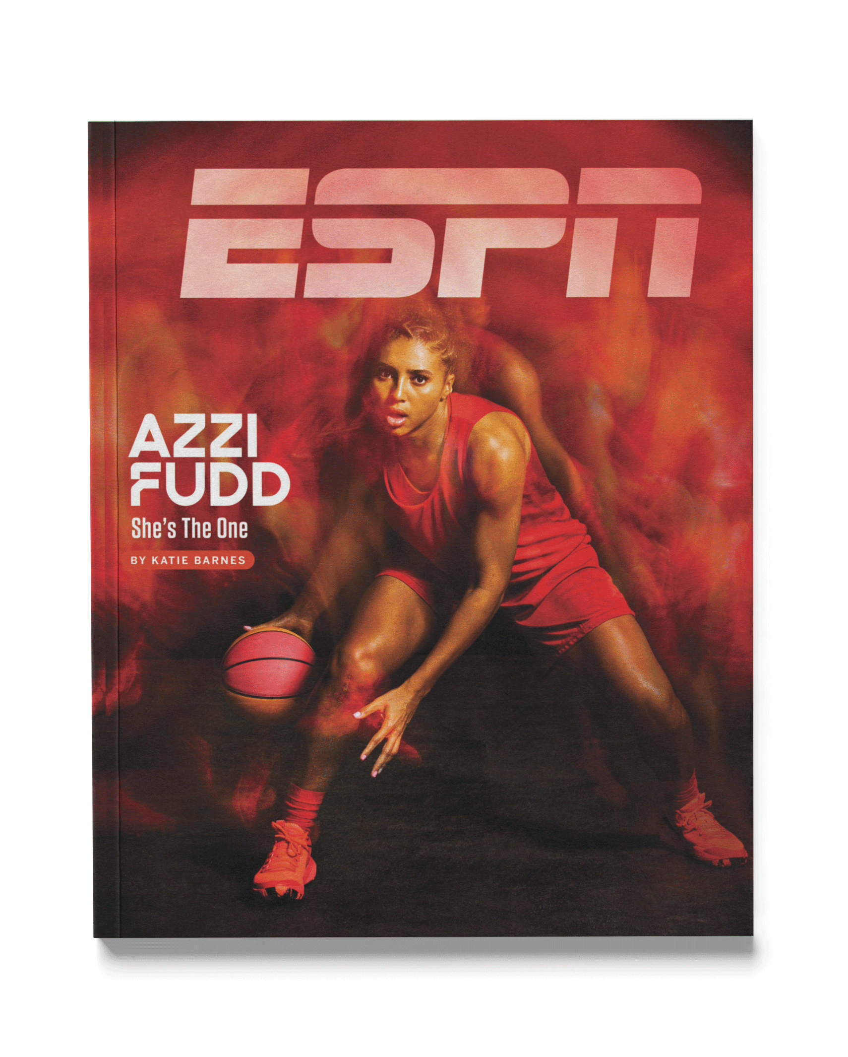
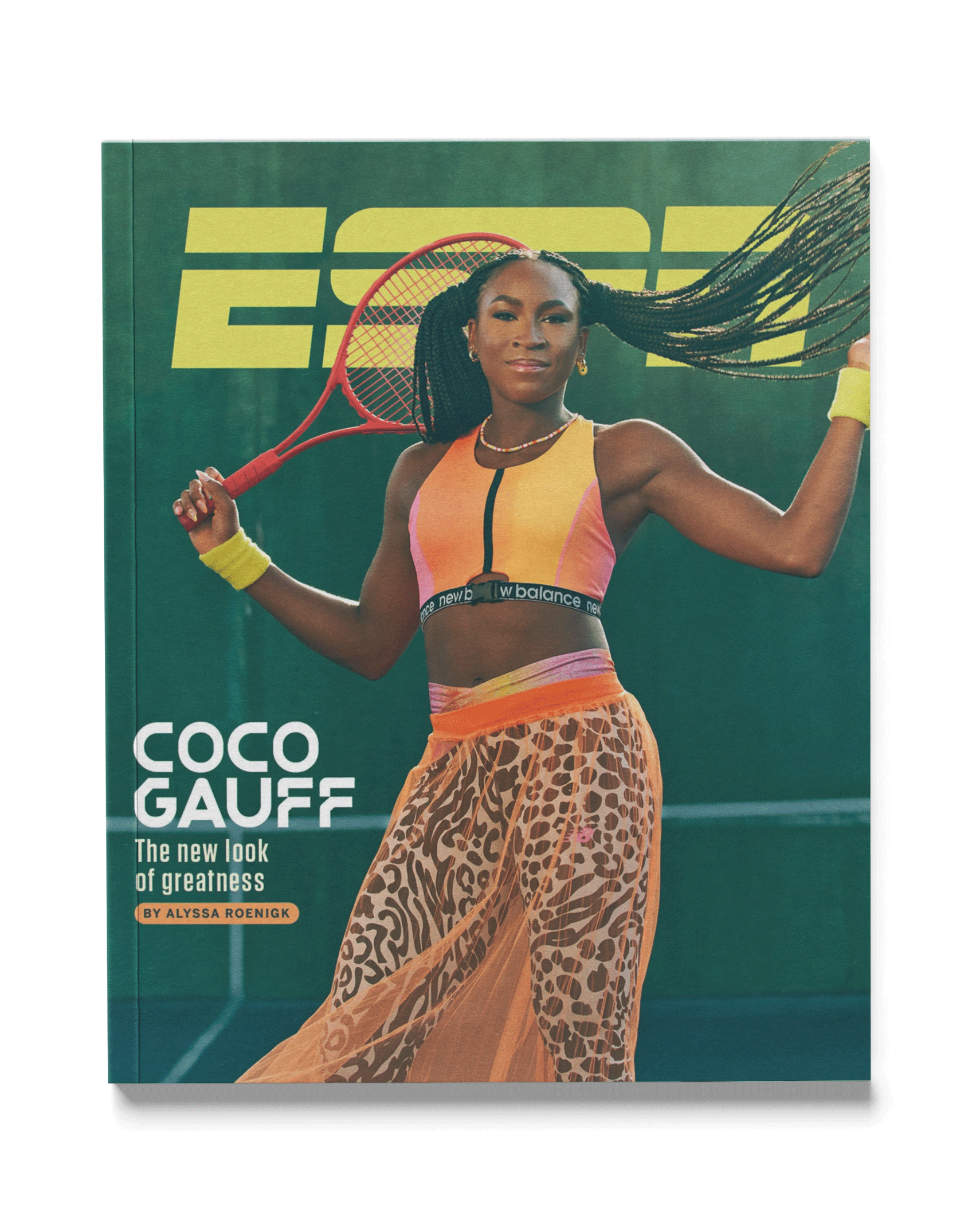
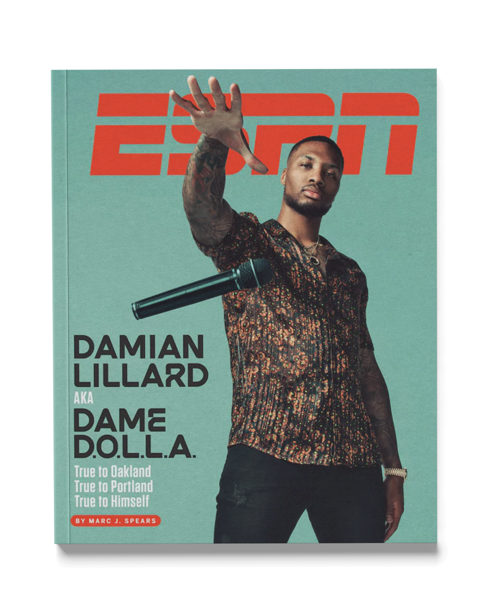
Custom CoverStory logotype was developed as a starting point which helped to set a tone for the full typeface and how characters worked overall as well as how the characters interacted with each other to form ligature pairs.


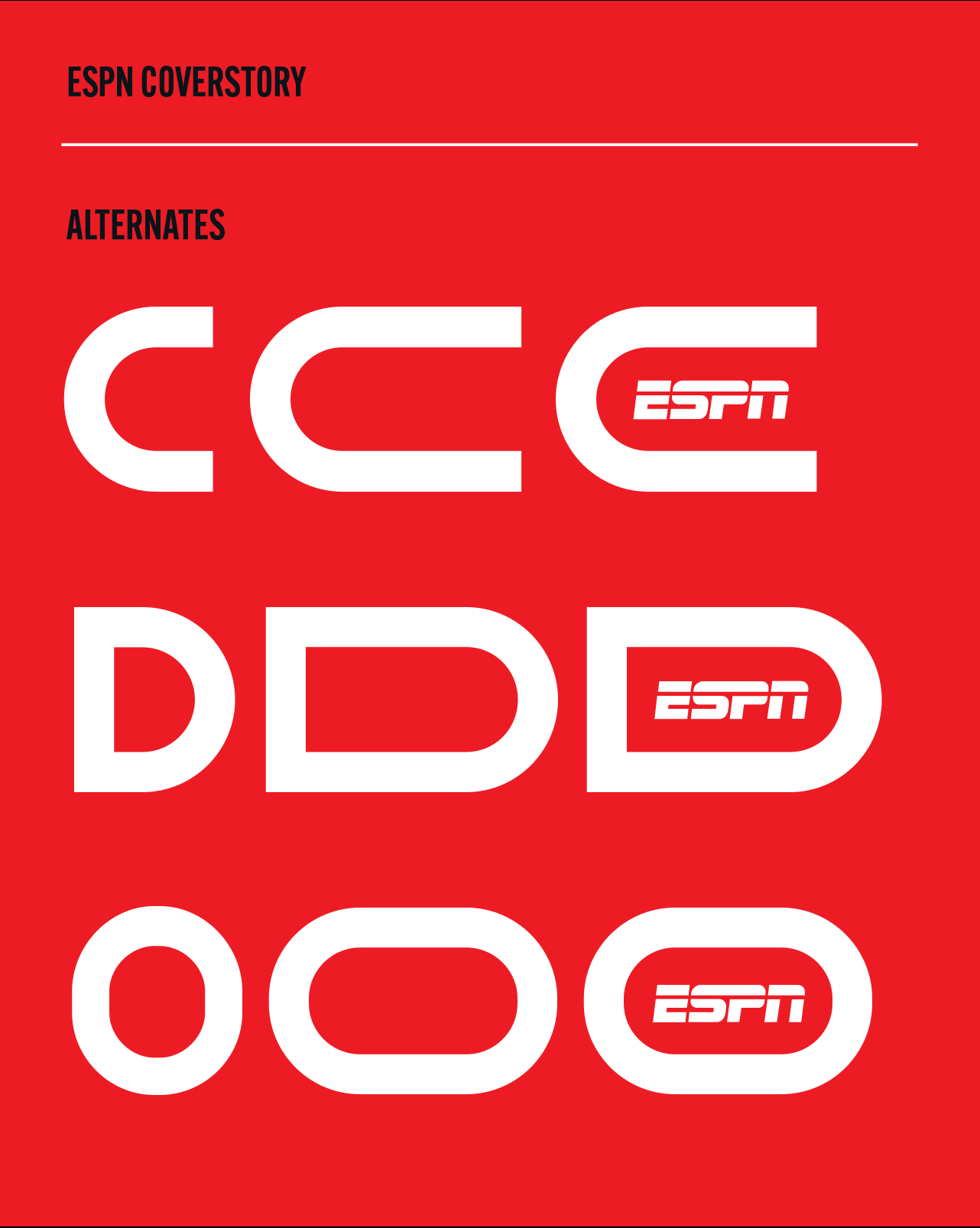
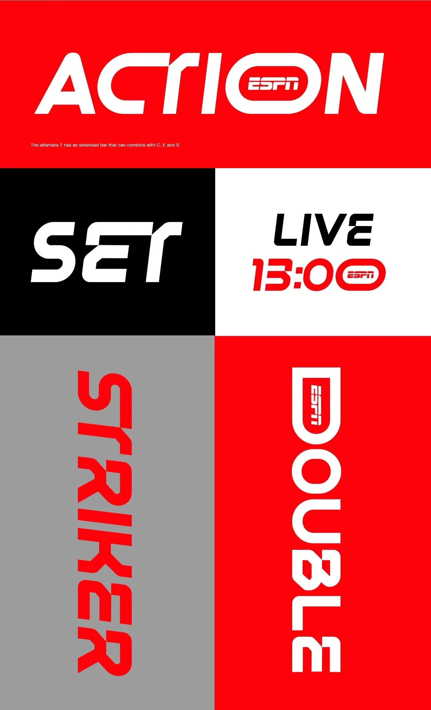
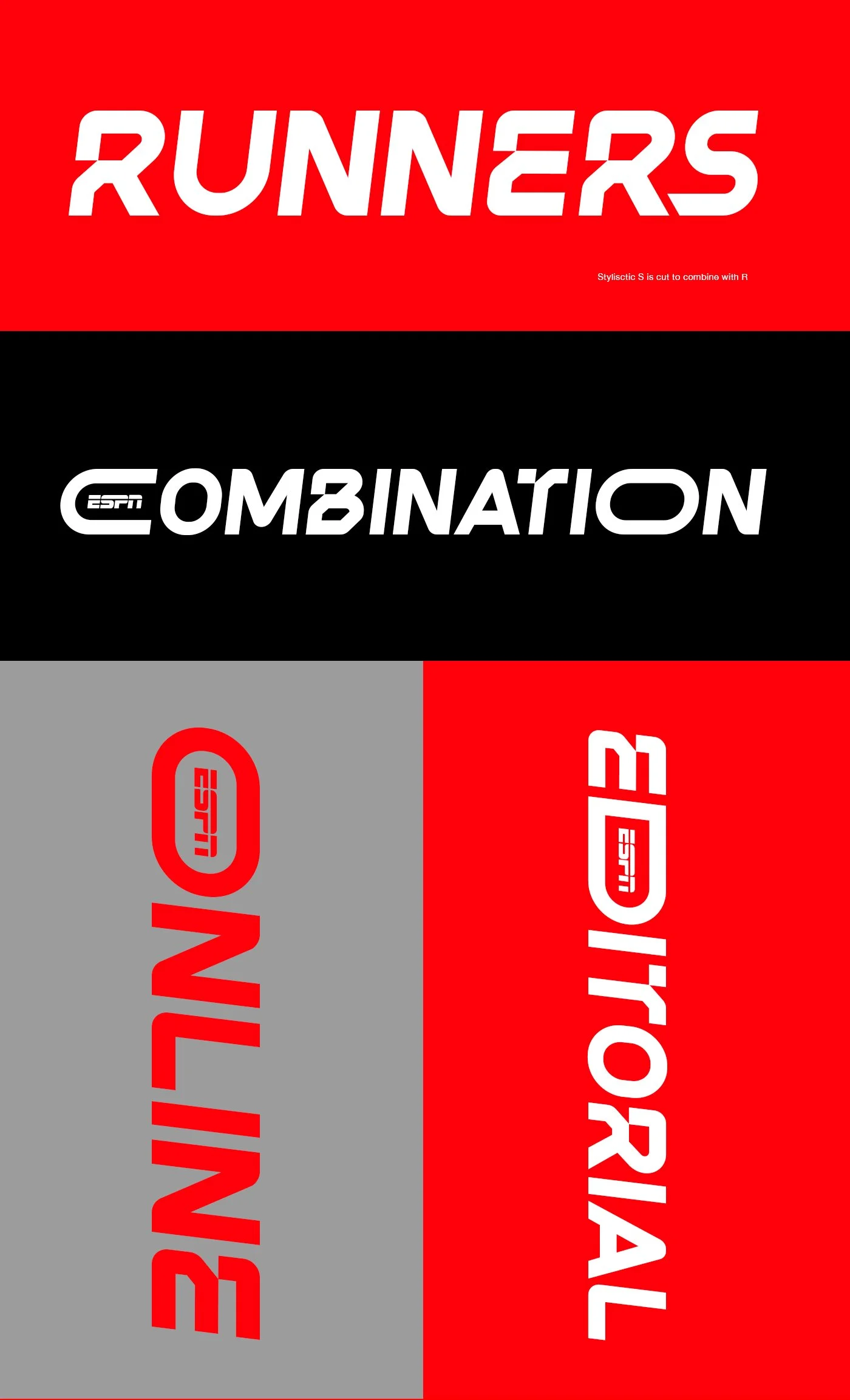
The CoverStory typeface was designed to be a versatile display font with stylistic alternates and ligature pairs that helped to add a greater feel of customisation and interaction. In these examples you can see for ligature pairs like CT, ET, ST work together as well as the extended O, D, and C that help create an opportunity to bring the ESPN logo in to the text.
All of these various details help to make animation of the type easy, as ESPN is very much a broadcast and digital platform this typeface was created with animation front of mind even though this font was created for an editorial purpose.